Mostly whimsy and drivel of no consequence. And CHEESE.
Now THIS is science! This is REALLY science!
21Jul2005 Filed under: I Have Learned Author: Kate BartholomewI was picking up some prescriptions (of MEDICATION, not DRUGS – my Doctor insists I make this distinction – I told her that someone who takes as many MEDICATIONS as I take at my age should get to call them DRUGS) when I noticed a brochure for a special kind of lotion. Here is the page that particularly caught my attention:
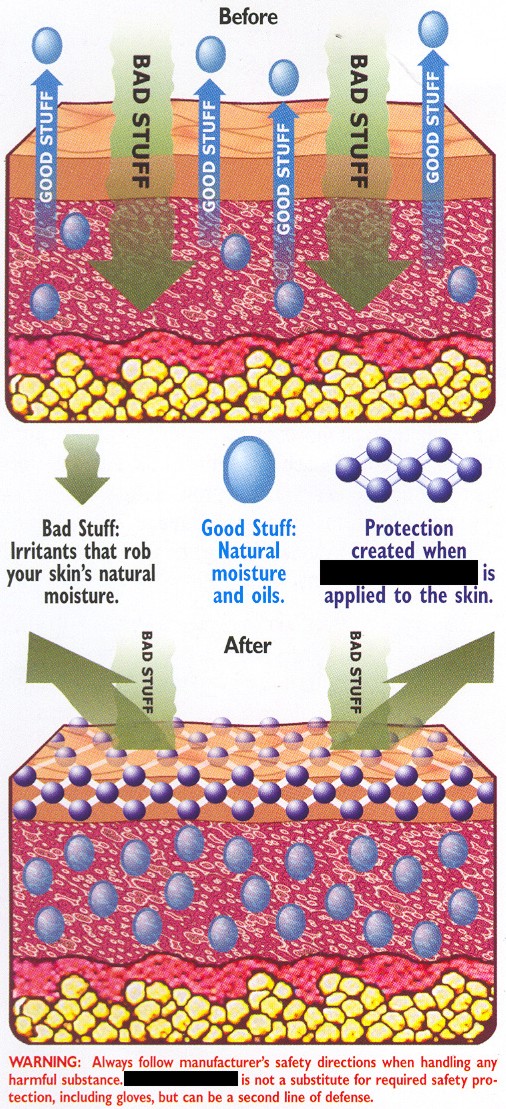
It certainly has a very detailed illustration of the epidermal layers. However, this doesn’t seem to jive with the “scientific” explanation of how the product works. Maybe it’s just me, but if one is going to render all the various anatomical entities of the skin, shouldn’t one try to explain the lotion’s mechanism with something a little more detailed than, “It keeps BAD STUFF out and GOOD STUFF in?”
Never fear, if they were trying to appeal to the lowest common denominator in the public, I have a better option for them. Here it is:
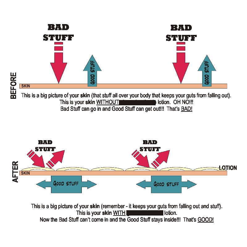
More clear? I think so. Of course you could also go the other direction and take the complex epidermal drawing and use correspondingly intricate explanative text (“this product keeps lipids, etc. in the skin so that it can maintain its natural moisture balance and at the same time creates a barrier that prevents environmental pollutants – free radicals, harmful UV rays, etc.- from assaulting the skin – blah blah blah”). The truth of the matter is that I cannot draw that well.